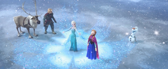
Disney's FROZEN
Movie review by Dennis D. McDonald
Some of my enjoyment of Frozen was based on memories of taking the kids to see movies like Aladdin, Beauty and the Beast, and Little Mermaid when they were little. I always enjoyed those movies, the kids loved them, and seeing Frozen provided a bit of nostalgia.
Frozen also demonstrates how far we have come with computer animation even if the story at the outset seems to be fairly standard fairy tale fare.
Things I especially liked about the movie:
- The Scandinavian venue, though somewhat stereotyped in parts, is refreshing.
- The character variety. The animators seems to have gone out of the way to provide physical variety even among minor characters. For example, look at the pull back from the choir at the beginning of the coronation scene. They’re all different.
- The little crown the queen wears. Very classy. It’s nicely designed with lines repeated in her ice castle.
- Olaf. He’s totally bogus and out of place and performs a weird musical number. In other words he’s a perfect foil to the otherwise serious goings-on.
- The trolls. Ugly but fun.
Things I didn’t like as much:
- The male characters. Dull and nowhere near as interesting as the two female leads.
- Make up and complexion. Too flawless on the two sisters. Merida in Brave has them both beat by a mile.
- Eyelashes. Again, the two princesses have ridiculous looking eyelashes that remind me of old cartoons where the only differentiation between sexes for animated animals was that the females had long eyelashes.
Still, the good outweighs by far the bad, I would have no misgivings about letting little kids see this one. Frozen may not be as engaging emotionally as Pixar films, but most animated films aren’t.
I put Frozen right up there, almost with Tangled, but with better music.

Review copyright © 2014 by Dennis D. McDonald


